Overview
What we delivered
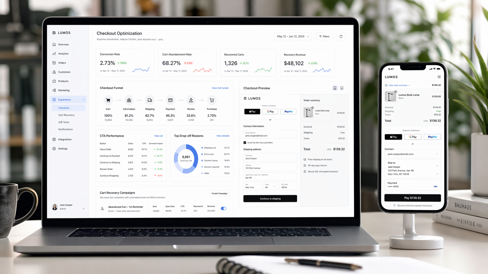
An ecommerce platform was facing a high cart abandonment rate and needed a better checkout experience to improve completed purchases. The buying journey contained too much friction, weak action visibility, and unnecessary steps that slowed users down. Stellar Code System redesigned the checkout UX to improve conversion flow, strengthen CTA effectiveness, and reduce cart drop-off.
Client
An ecommerce business focused on improving checkout completion, purchase conversion, and overall buying experience.
Challenge
The platform was losing too many users during checkout. The buying journey introduced avoidable friction, key calls to action were not prominent enough, and the purchase process felt heavier than necessary.
Cart abandonment rate too high
Weak checkout UX flow
CTA placement not driving enough action
Too many friction steps before purchase
Solution
Stellar Code System redesigned the ecommerce checkout experience to reduce friction, improve decision flow, and make the path to purchase faster and clearer.
1. Checkout UX Redesign
Redesigned the checkout UX journey
Improved clarity across purchase steps
Created a smoother transition from cart to payment
Made the checkout experience easier to complete
2. CTA Optimization
Improved CTA placement across the checkout flow
Made high-priority actions more visible
Strengthened user direction toward purchase completion
Reduced hesitation during key decision moments
3. Friction Reduction
Reduced friction steps in the checkout process
Removed unnecessary actions before payment
Simplified the journey for faster completion
Improved overall purchase momentum
Technology Stack
UX Focus: Ecommerce checkout UX redesign for conversion improvement
Optimization Strategy: CTA placement refinement and friction-step reduction
Commerce Flow: Cart-to-checkout journey improvement for lower abandonment
Implementation Timeline
Phase 1 (Week 1): Checkout audit, abandonment analysis, CTA performance review
Phase 2 (Weeks 2-3): UX redesign, CTA restructuring, friction-step removal
Phase 3 (Weeks 4-5): Testing, rollout, and conversion performance monitoring
Results
The ecommerce UX improvement project increased purchase conversion and reduced the number of users abandoning their carts before checkout completion.
Key Metrics:
+55% conversion rate
-30% cart abandonment
Business Impact:
Improved checkout completion across the buying journey
Reduced user hesitation during purchase steps
Made calls to action more effective
Created a cleaner ecommerce conversion flow
Client Testimonial
Words from the client
The checkout redesign delivered exactly what we needed. Conversions improved, abandonment fell, and the path to purchase now feels much more intuitive for customers.
Technical Highlights
Checkout UX redesign
CTA placement optimization
Reduced friction purchase flow
Conversion-focused ecommerce UX
Cart abandonment reduction
Streamlined buying journey
Future Enhancements
The ecommerce experience is now ready for deeper conversion optimization and personalization.
Personalized checkout experiences
Smart cart recovery workflows
Payment-step A/B testing
Upsell and bundle UX optimization
Returning customer fast checkout
Previous case study
SaaS Platform UX Optimization for Better Onboarding and User Retention
SaaS UX Design
Next case study
Mobile App UX Redesign for Better Navigation, Engagement, and Session Depth
Mobile App UX Design
Let’s build yours
Want similar results for your business?
Share your requirements—we’ll propose a premium, scalable solution.